Going Beyond Euclidean Distance
Intro
I've spent most of my life in major cities with major public transportation infrastructure. Throughout various points, I've had to interact with multiple forms of transportation like walking, biking, buses, trains and cars. Each of these come with various subjective costs like price and comfort, but come with very real guarantees around total transportation time. Because of these combined factors, optimizing a route from point A to point B or even just knowing how far you are from anything is quite difficult.
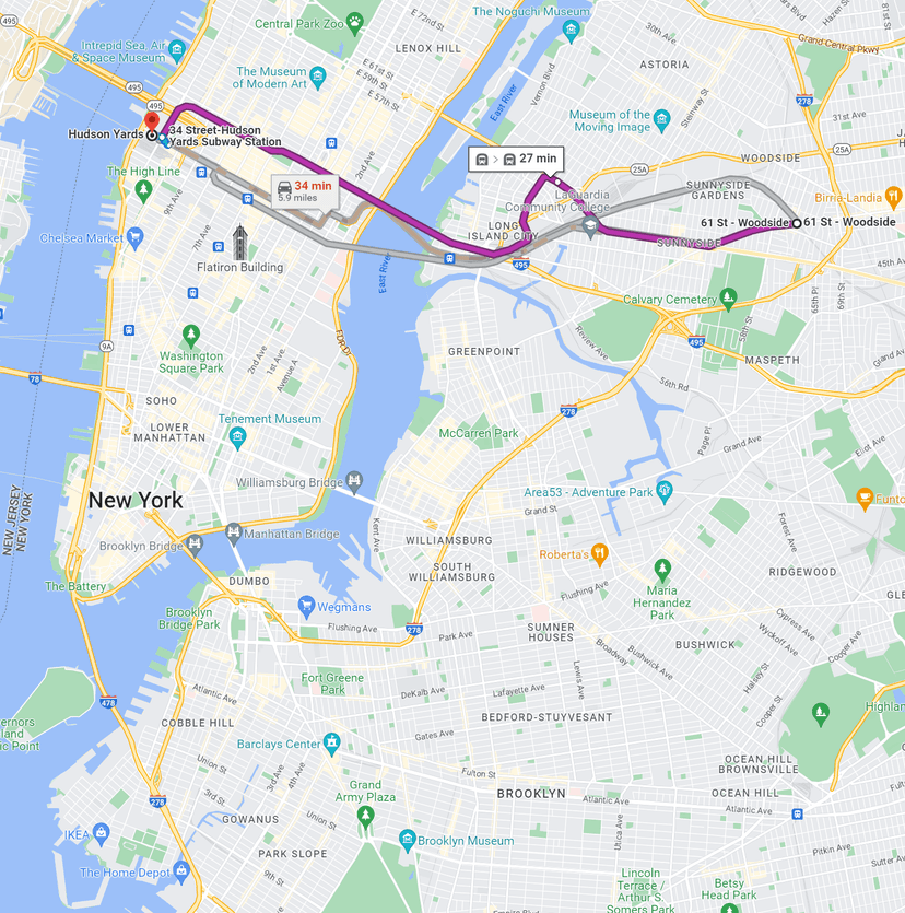
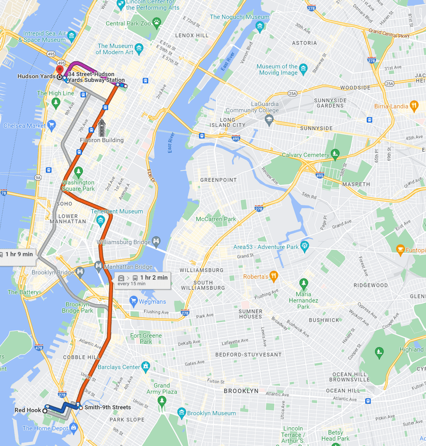
Let's put an example behind this complexity. Suppose that I'm moving to New York City for a new job. My job requires me to come to the office five days a week, and I need to find a place to live. Looking at a map of NYC, I see two neighborhoods of note: Redhook and Sunnyside. Both have relatively cheap rent (a major plus in this city), and both are roughly equidistant when measured in euclidean space i.e. 'as the crow flies'. When I look at their commute time though, I get a completely different answer. From Red Hook to Hudson yards, it will take me 1HR! From Sunnyside to Hudson yards, it will take me 30 mins. That's half the time at the same distance just because you have access to the 7 express train that runs through Sunnyside while in Redhook you have to take a bus and transfer to a slower line.
Our simple example can be determined by inspection, but why aren't there more accessible ways to get this information out of a map? When choosing where to live, shouldn't I know how close I am to locations that I will actually commute to? In a large and transport diverse city, your proximity to the locations you love are measured by your commute, not by the line you can draw on a map.
This blog post won't fully solve our problem, but it will be my first step into the world of mapping and routing using real life data.
Defining Our Problem
Before we jump into a solution, it’s essential that we come up with a rigorous and simple definition for our problem. As developers, it is essential that we create the space for finding the theory in our problems while embracing the fact we’ll only know that it’ll work when we implement it and measure its performance. At the time of writing this post, I don’t know how our solution will evolve.
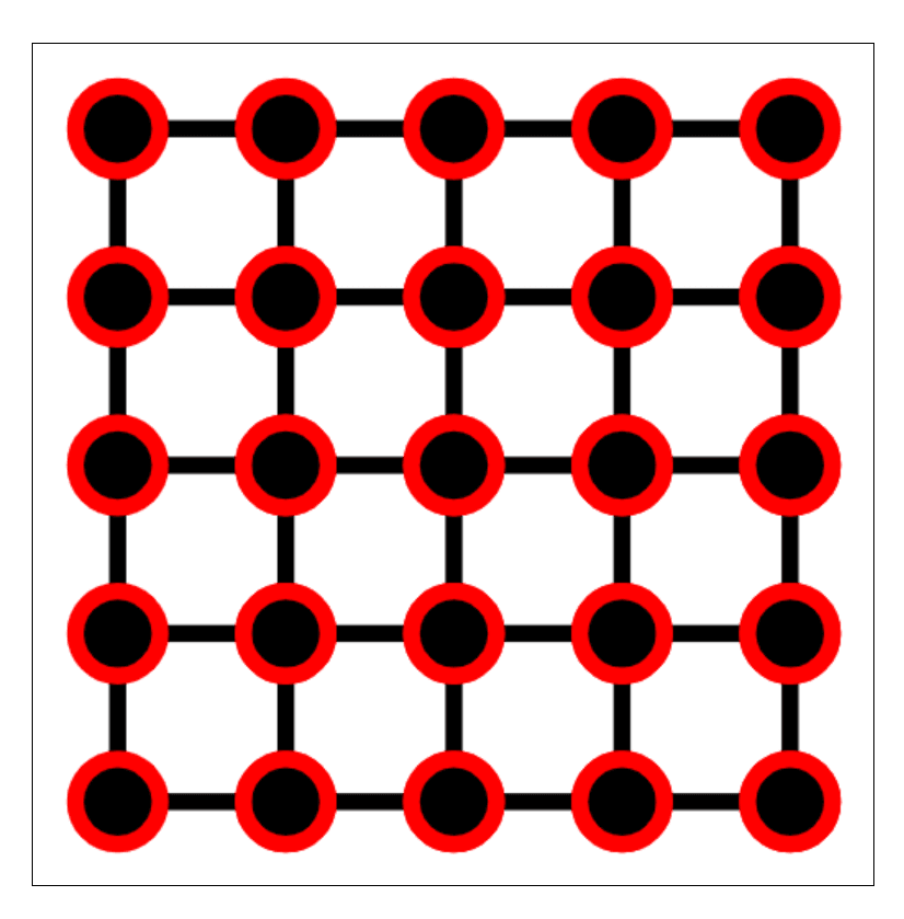
So let’s describe our ‘map’. Suppose that there are two modes of transportation available in my city, walking and trains. We can expand this to more forms of transportation as we expand our problem, but these options are a daily reality for many urbanites. Additionally, the velocity with which you walk is fixed and proportional to the speed of the subway. While this proportion would change per line and per day, for the sake of our static representation it should accurately reflect a single route request. Finally, let’s say our city has a grid layout with subway lines that contain stops along intersections in that grid.
Creating A model
Given the constraints that we established in our previous section, let’s choose a model that accurately represents this problem. When it comes to path finding, map representation and optimization problems we know that graphs are a powerful tool. For the sake of brevity I will not be explaining graphs, but I will link to references that explain potentially non obvious material. So what kind of graph best represents our transportation scenarios.
For simplicity’s sake, all of our edges will be unweighted and undirected. While this is unrealistic, it is easy to change as we start using more complex data. Additionally, it doesn’t change the power of the visualization itself. There will certainly be cycles in the graph. Nodes in the graph contain no additional information … for now. Because our graph will be sparsely connected, the best representation for this will be an adjacency list.
Finding the distance between a single source and all possible sinks in this graph model, we’ll be using breadth first search.
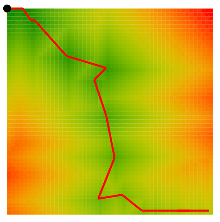
Fun visualizations
Here are some examples.
Town, No Subway
Town, Single Subway
Large Town, Large Subway
In these visualizations, we can see that a single subway can severely influence how 'close' you are to where you need to go. While the conclusions may be obvious for our small case, as we increase complexity this visualization will become more useful.
Interactive Version
Next Steps
This rough implementation leaves us with a lot of potential next steps. We can expand the complexity of the problem statement or we can try to incorporate real life data from open source map data. Here are a few ideas that I have for the future of this project:
- Using street and transportation data from manhattan
- Adding multimodal transportaion methods i.e. bike + subway, car + walk
- Scaling up. How do you change your implementation to handle city's worth of data?
- Deploying it live. How doy you turn this into a production app?